📓 Bootstrap Basic Elements
In this lesson, we'll learn how to implement several of the most common Bootstrap resources and styles. These resources will make our projects look considerably nicer without much additional work. We'll also learn how to add our own styles alongside those from Bootstrap.
Project Setup
We'll create a website to summarize what we've learned so far in this section — and we'll add Bootstrap styles along the way.
Start by creating a new project directory called section-in-review. It will contain an .html file named index.html and a css directory.
Now let's add some starter code to index.html:
<!DOCTYPE html>
<html lang="en-US">
<head>
  <title>My First Section at Epicodus</title>
</head>
<body>
  <h1>My First Section at Epicodus</h1>
  <p>
    I've almost finished my first course section at Epicodus. Here are some of the things I've learned so far:
  </p>
  <h2>Command Line</h2>
  <ul>
    <li>Navigating my documents through the command line.</li>
    <li>Creating new files and folders through the command line.</li>
    <li>Moving and deleting files and folders through the command line.</li>
    <li>Retrieving my current location from the command line.</li>
  </ul>
  <h2>Git and GitHub</h2>
  <ul>
    <li>Initializing local Git repository, and create remote GitHub repositories.</li>
    <li>Tracking and committing changes with Git.</li>
    <li>Pushing a local Git repository to a remote GitHub repository.</li>
    <li>Branching a project to make multiple copies.</li>
    <li>Merging multiple Git branches back together.</li>
    <li>Cloning down a project from GitHub to my local machine.</li>
    <li>Publishing a website on GitHub pages.</li>
  </ul>
  <h2>HTML</h2>
  <ul>
    <li>Using HTML tags to create websites.</li>
    <li>Indenting and organizing HTML correctly.</li>
    <li>Incorporating block elements.</li>
    <li>Including inline elements.</li>
    <li>Using both spans and divs.</li>
    <li>Adding classes and ID's to style HTML with CSS.</li>
  </ul>
  <h2>CSS</h2>
  <ul>
    <li>Creating a stylesheet.</li>
    <li>Using CSS selectors to specify an HTML element.</li>
    <li>Writing CSS rules to style particular elements in my HTML.</li>
    <li>Floating elements to create columns, sidebars, and other alignments.</li>
    <li>Padding, margins, and the box model.</li>
    <li>How CSS cascades to apply styles.</li>
  </ul>
  <h2>Bootstrap</h2>
  <ul>
    <li>Downloading and installing Bootstrap.</li>
    <li>Adding Bootstrap styles to a website.</li>
    <li>Navigating Bootstrap documentation.</li>
    <li>Creating websites with Bootstrap.</li>
  </ul>
</body>
</html>
Let's take a look at our site:

Not very exciting so far. It's time to add Bootstrap!
Adding Bootstrap
As described in the Bootstrap: Downloading & Installing lesson, let's download a copy of Bootstrap version 5.2 and place the bootstrap.css stylesheet into our project's css folder.
Note: We are taking this approach instead of a CDN because it can be useful to take a look at the bootstrap.css file for development purposes. That's also why we aren't using the minified version.
Our project directory should be organized like this:
section-in-review
├── css
│   └── bootstrap.css
└── index.html
Then, we'll link this Bootstrap stylesheet in the <head> tags of our HTML file:
...
<head>
  <title>My First Section at Epicodus</title>
  <link href="css/bootstrap.css" rel="stylesheet" type="text/css">
</head>
...
Remember, when ... is in a code snippet, this simply means that we've omitted code from the file we're depicting, in order to make it clearer to see where changes have occurred.
Bootstrap Styles
If we refresh our page, we'll see that our website already looks different:

This shows that just with loading Bootstrap into our project, we can greatly improve the look of our website. If you don't enjoy styling your websites, installing Bootstrap into your project is a good baseline for your websites.
However, we've hardly scratched the surface of what we can do. Bootstrap provides many styling rules we can apply to our HTML. Let's add one now.
Containers
One of the most commonly-used Bootstrap elements is a container. Containers wrap our content and add padding that dynamically increases or decreases in size depending on the user's viewport.
We can add a container to our HTML like this:
<!DOCTYPE html>
<html lang="en-US">
<head>
  <title>My First Section at Epicodus</title>
  <link href="css/bootstrap.css" rel="stylesheet" type="text/css">
</head>
<body>
  <div class="container">

    ...

  </div>
</body>
</html>
Here we've placed a div directly inside our <body> tags with a class of container. Note that ... is a placeholder for all our body HTML — don't remove the HTML from your own project.
If we refresh the page, we'll see that padding has been added around the edges of our content:

Also, if we resize the width of the browser window, we can see that the amount of padding automatically changes depending on the size of the viewport. When we integrate Bootstrap elements and components into our pages, they're automatically responsive. This is another way that Bootstrap can greatly improve our lives as developers.
Bootstrap is essentially a really big CSS stylesheet, with some JavaScript. Earlier, we learned how to add classes to HTML elements to style our pages. Adding Bootstrap's built-in container class is very similar. But instead of manually defining CSS rules that style anything with the container class in our own stylesheet, the Bootstrap stylesheet we included in our project already has CSS rules for the container class defined. All we need to do is add this class in order to make use of the CSS in the bootstrap.css file!
Typography
Typography includes the style and appearance of text in our webpages, and Bootstrap includes many easy ways to style text.
Blockquotes
We can add blockquotes to display nicely-formatted quotes on our page.
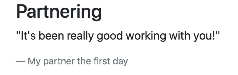
Let's add another section to our site. We'll call it "Partnering" and it will contain a quote from one of our partners this section:
...

      <h2>Bootstrap</h2>
      <ul>
        <li>Downloading and installing Bootstrap.</li>
        <li>Adding Bootstrap styles to a website.</li>
        <li>Navigating Bootstrap documentation.</li>
        <li>Creating websites with Bootstrap.</li>
      </ul>
      <h2>Partnering</h2>
      <figure>
        <blockquote class="blockquote">
          <p>"It's been really good working with you!"</p>
        </blockquote>
        <figcaption class="blockquote-footer">
          My partner the first day
        </figcaption>
      </figure>
    </div>
  </body>
</html>
Note that <figure>, <blockquote>, and <figcaption> are all HTML elements. The Bootstrap styles are added via the classes we apply to the elements: class="blockquote" and class="blockquote-footer".
The <figure> element is used for self-contained content that is a part of the main HTML document. This is most often used for an image or a chart that is related to other HTML on the page. We can also use it to create a block quote.
The <figcaption> element is always used within the <figure> elements, and it's used to provide a caption to the figure. In our case, the figure is a block quote represented by the <blockquote> element.
Check out the results:
To learn about other typographical improvements we can make to our webpage, visit the Bootstrap docs on typography.
More Built-in Classes
Another great feature of Bootstrap is the wide variety of built-in classes we can add to almost any element.
Let's highlight a few concepts we found enjoyable during this course section in green. We can do this by adding the bg-success class to various <li> tags on our page.
bg stands for "background", and success is a name used throughout Bootstrap to refer to a particular shade of green:
...

      <h2>Git and GitHub</h2>
      <ul>

         ...

        <li class="bg-success">Publishing a website on GitHub pages.</li>

         ...

      </ul>
      <h2>CSS</h2>
      <ul>

        ...

        <li class="bg-success">How CSS cascades to apply styles.</li>
      </ul>
      <h2>Bootstrap</h2>
      <ul>

        ...

        <li class="bg-success">Creating websites with Bootstrap.</li>
...

Similarly, we could use the bg-info class on our existing blockquote to add a blue background. Try it out on some of the <li>s in the project.
To see all of the built-in classes for background colors, visit the background color documentation.
To see a list of the ways that we can style text, visit the text color documentation and the more general documentation for text.
Cards
Another simple effect that can easily organize a page is a card. It allows us to organize content inside a card. Cards are also automatically responsive and will resize automatically as the user's viewport changes in size.
Let's update our HTML to use a Bootstrap card, and then take a look. Add the following code below the block quote that we added earlier:
...
  <div class="card">
    <div class="card-body">
      <h5 class="card-title">Command Line</h5>
      <ul class="card-text">
        <li>Navigating my documents through the command line.</li>
        <li>Creating new files and folders through the command line.</li>
        <li>Moving and deleting files and folders through the command line.</li>
        <li>Retrieving my current location from the command line.</li>
      </ul>
    </div>
  </div>
...
Our card has a class of "card" and then we have various classes inside the card depending on the element: "card-body" for the body of the card, "card-title" for the title, and "card-text" for the text. Here's what it looks like:

This is a very basic card and we can do a lot more with it! For instance, there's an option to add images and links that fit inside the card. We can also adjust the size and style of our card by changing the style attribute on the parent <div> for the card. Here's a short example:
...
<div class="card" style="width: 18rem;">
  <img src="..." class="card-img-top" alt="...">
  <div class="card-body">
    <h5 class="card-title">Card title</h5>
    <p class="card-text">Some quick example text to build on the card title and make up the bulk of the card's content.</p>
    <a href="#" class="btn btn-primary">Go somewhere</a>
  </div>
</div>
...
To learn more, check out the documentation on Bootstrap cards.
Custom Styles
It's common to start with a Bootstrap theme or stylesheet and then customize it further. To do this, we need to create our own stylesheet, which we can then use to override Bootstrap's styles. This is the right way to customize our styles. Don't ever go into a Bootstrap CSS or JS file and customize the code there. While it will technically "work" to do this, it's very bad practice to directly edit an external framework.
Let's say we want to override Bootstrap styles with our own styles. Here's how we can do it. The first step is to ensure that your custom stylesheet(s) are listed below the bootstrap style sheet in the <head> tags of your HTML document. Any time two stylesheets have rules about the same element, the rules in the latter stylesheet will override the rules in the former.
...
<head>
  <title>My First Section at Epicodus</title>
  <link href="css/bootstrap.css" rel="stylesheet" type="text/css">
  <link href="css/styles.css" rel="stylesheet" type="text/css">
</head>
...
Then, we can define what our custom styles we'll be. In this example, we want the <h1> tags to be bold.
h1 {
  font-weight: bold;
}
Our stylesheets (both Bootstrap and our custom CSS) get loaded from top down. Here, the first stylesheet (bootstrap.css) has instructions for <h1> elements to appear a certain way. When our second stylesheet is loaded, it also instructs the <h1> headings to appear a certain way. This second stylesheet's <h1> rule overrides the <h1> styles from the first stylesheet simply because it's loaded last.
Let's temporarily switch the order of our stylesheets and see what happens.
<!DOCTYPE html>
<html lang="en-US">
<head>
  <title>My First Section at Epicodus</title>
  <link href="css/styles.css" rel="stylesheet" type="text/css">
  <link href="css/bootstrap.css" rel="stylesheet" type="text/css">
</head>
<body>
  <h1>My First Section at Epicodus</h1>
  ...
</body>
</html>
If we refresh our page, the bolded text is gone. Even though our CSS rules are still present in styles.css, our custom styles are now loading first and Bootstrap's styles are loading second. Bootstrap styles are therefore overriding our custom styles so we don't see our bold text.
This is why we always want to link our custom stylesheets after Bootstrap stylesheets.
Next Steps
While our site still looks relatively plain, we've still added a basic level of style that makes our webpage look more modern and polished than it did before. What's more, including Bootstrap in our projects automatically makes our application responsive to different screen sizes! You certainly aren't expected to be an expert on styling — but the nice thing about Bootstrap is that you don't have to be.
By the way, we can do a lot more with Bootstrap! In fact, we've just scratched the surface with what we've covered in this lesson. We highly recommend that you experiment further with Bootstrap in the projects you create.
Even though there's more of Bootstrap to explore, we won't be covering how to implement any additional Bootstrap features. The next learning opportunity for us is to learn how to navigate Bootstrap's documentation and learn how to teach ourselves how to implement new features without the help of an outside guide. While there's nothing wrong with using guides, learning how to navigate and understand official documentation in order to teach yourself something new is a core skill that junior developers need to foster.
So up next, we'll take a walk through Bootstrap's official documentation and learn some practical tips for navigation and exploration. Of course the best practice is actually reading the documentation and using it